Wednesday, December 30, 2009

PJD How To - Making those little symbols

3 comments
Those fun symbols that everyone posts on their blogs... Want to know how it is done?
I ♥ it!

& hearts ;

take away the spaces.. ♥

Also there are other symbols:

♠ = ♠
♣♣ = & clubs ; (no spaces)
♦♦ = & diams ; (no spaces)
←← = & lar r; (no spaces)
→→ = & rarr ; (no spaces)
↑↑ = & uarr ; (no spaces)
↓↓ = & darr ; (no spaces)
Read more...

I'm Seeing Hearts...New Design Launches Today

4 comments


My new design for Love to Read For Fun has launched today. 

Go-By: Hearts for Love, but don't make it look like a valentine's card. Humorous, Fun.
Read more...

Free Twitter Buttons

5 comments


Read more...

Win a Button/Badge Contest - Update!

2 comments

Sorry everyone, I forgot to add an end date to the WIN A BUTTON contest.

Enter Contest Here

Contest will end January 12th, 11:59 PM CST.

Good Luck!
Read more...
Tuesday, December 29, 2009

Using Google Docs For Contests - & Badge Contest!

68 comments
We've all seen them, those handy little forms that people are using to run their contests. But what are they and how easy are they to use? Let's just say I am a BIG FAN.

The Pros
  • Emails are hidden to keep people from getting spammed
  • Entries are collected in a handy-dandy spreadsheet for easy contest winner picking
  • Very organized collection
The Cons
  • Users can't see if they have already entered the contest, so you might get double entries
  • Users are used to the comment and win contests so they might think they entered just by commenting

I really think that the Pros very much out-weigh the Cons, so I'm going to go over how to use Google Docs to run a contest, and tricks that I've found that work well for me.  Sound good??? Let's get started.

What is Google Docs?
Google Docs is a service offered by Google, where you can create spreadsheets, databases and documents, from scratch or using a template.  The main thing I use Google Docs for is the forms.  Very hand function, and something that before you would need a web developer using ASP & MySQL to create. Something way over my head. Now all you need is a GMAIL account - which everyone seems to have.  Don't have one, go get one - Google is taking over the planet, jump on that gravy train, because everything is Free.

Got your gmail account? Good run over to http://docs.google.com to get started.  Sign up, sign in.
You will be brought to your ALL ITEMS page. This is where you start and where all your forms will be listed. A blank one will look like this:


Let's make our first form for a contest I'll run at the end of this post. This contest will be for a FREE Blog button/badge design. (Scroll down for deets)


1. Go to Create New in the upper left hand area

2. Click on FORM

3. You will be taken to the form dashboard

4. Lets Title this form.  Where it says Untitled Form lets I'm calling it PJD Contest Entry.  You want this to be rather original because if you have multiple forms, you need to be able to know which one is which.

5. Type NAME where it says "Sample Question 1"

6. Make sure Make this a required question is checked off (used this for all questions that you want people to HAVE TO answer.  This is called form validation

6. Hit Done - Yeah! You have your first form entry!

7. Now there should be a Sample Question 2, move your mouse over that question, it should highlight yellow, and settings will appear. The pen is to edit. The boxes are to duplicate.  The trash to delete that question

8. Change Sample Question 2 to Email, make sure to check off the required question box.

9. Go to ADD ITEM in the top left corner. We are now doing a check box to validate that they are a follower - which is the usual reason for a personally hosted contest. So click on the item CHECKBOXES

10. Change Untitled Question to Follower? 
  • I'm going to add help text, this is small text under the question to help the user answer the question.  My help text will be: You must be a follower to enter this contest.   
  • Question Type is Checkboxes.  
  • The first checkbox - change Option 1 to +2 Old Follower 
  • Click in the blank second option - change Option 2 to +1 New Follower 
  • The make sure to check off the required question box. 
  • Click Done

11. Extra Entries!
  • Go to Add Item - Click Checkboxes 
  • Change Untitled Question to Extra Entries 
  • Help Text:  Please provide proof of extra entries with a link below. 
  • Let's give them extra ways to get contest points:
    • +1 Tweet
    • +2 Sidebar
    • +3 Post
    • +5 Parajunkee Design Button
  • This question does not have to be entered, so do not check off make this required.
  • Hit Done

12. Space to provide links
  • Go to Add Item - Click Paragraph Text 
    • This Item is for multiple entries  
    • Use this if you want to collect paragraphs of information or multiple lines of text
    • Change Untitled Question to Links for Extra Entries 
    • Help Text:  Please provide proof of extra entries here.
    • This question does not have to be entered, so do not check off make this required.
    • Hit Done
 13. To save my bad addition skills I provide an area to add up the points.
  • Go to Add Item - Click Text
    • This Item is for a single line entry
    • I usually just use these for name, email, url entries
  • Change Untitled Question to Add up your entries please +1
  • This question does not have to be entered, so do not check off make this required.
  • Hit Done
  •  Hit Save
    Your entries for the form are now done! 
    This is what mine looks like:


    If you don't want yours to be plain white we can style it.  Go to THEME: Plain in top menu bar. By clicking on it will take you to a list of different themes. I'm going with a Theme called Blue on the last page that matches my style. You pick your theme just by clicking on the image. Don't forget to hit APPLY.


    Now it is time to EMBED.  Oooh scary.
    1. Go to More Actions in top menu.  Make sure your form is saved.
    2. Click on embed.
    3. A menu pops up with a string of code. This is what you need to copy and paste in your post.
    4. I'm working with Blogger so I'm going to walk you through using your blogger dashboard.
    5. Create your post with all your contest details
    6. Go to Edit HTML
    7. Scroll Down! At the end of the post - recommended to do this at the very end - copy and past that code.
    8. OMG it is huge and doesn't fit in my post column!
      1. Let's fix that - it is time to code
      2. Go back to Edit HTML
      3. This is what the code looks like:
      4. What you are looking for is the width & height tags these can be changed without any problems.  I like to change mine to a percentage, so I don't have to figure out pixels for my columns.  So change that width="760" to width="95%"
      5. My personal preference is to use 95% instead of 100% because it usually doesn't have buggy problems.
      6. The code should look like this:
      7. Go to Compose it should show up better now.
    You now have a form!

    Publish your post and wait for the entries.


    How to view those entries?
    1. Go to Google Docs
    2. You will see a list of your forms that you created
    3. Click on the form you just created
    4. It will show you the spreadsheet with all the entries
    5. It is that easy. 

    Tips & Tricks
    1. To battle the Cons I usually encourage contest entrants to comment on the posts so they can look in the comments section to see if they entered the contest.  This is also good practice if you enter a lot of contests.  Make it your practice if you fill out a form to make a comment in the post.
    2. People comment thinking this is how to enter.
      1. You really can't battle people that don't read and just enter a contest.  There are people that don't pay attention to rules and details.  If your rules are stated plainly it is their fault they didn't read the post and enter correctly.  It is your choice whether you count their entry or not. I usually don't, because I find it insulting that they didn't take the time to read over the instructions. 
    3.  Counting your entries


    Now for the Contest! Win a Blog Badge/Button like the ones on the sidebar ---->
     
      Contest Deets & Rules 
      1. FILL OUT THE FORM BELOW
      2. You must be a follower of Parajunkee Design
      3. You must have an existing blog
      4. Winner will receive 1 badge and the code to enter into an HTML/Java widget
      5. Contest is open to EVERYONE
      6. Contest ends January 12th
      7. Hint* - so you can know you entered this contest, comment in this post!

      Extra Entries:
      • +1 Tweet
      • +2 Sidebar
      • +3 Post
      • +5 Parajunkee Design Button


              Read more...
              Wednesday, December 16, 2009

              How to have a "Grab My Badge"

              15 comments
              I've gotten a few questions on how to add a grab my badge/button link in the sidebar.  It is really very easy to do if you have some basic HTML knowledge.

              First off you have to host your button/badge on a third party server such as www.flickr.com

              1. Once you have your image hosted, get the URL: http://farm3.static.flickr.com/2695/4190373200_e20fa291a5_o.png
              2. Go to blogger dashboard and insert a new HTML/Javascript widget
              3. Title Your Widget - i.e. Grab my Badge!
              4. Within the content you have to tell blogger what image to display and where to link it to. Here is the sample code:
              <a href="http://parajunkeedesign.blogspot.com/"><img border="0" width="90%" src="http://farm3.static.flickr.com/2695/4190373200_e20fa291a5_o.png"/></a>

              In the first highlighted that is where you put your URL.  The a href= is the HTML code link.
              In the second highlighted area that is going to tell the browser what image to display.

              ALWAYS remember paste your code between the " " marks.

              5.  Now it is time for the textarea code

              <textarea id="code-source" rows="3" name="code-source"><a href="http://parajunkeedesign.blogspot.com/"><img border="0" width="90%" src="http://farm3.static.flickr.com/2506/4125657740_8bd542db80_o.png"/></a></textarea>

              The area highlighted is the same exact code that you worked in early, just wrapped in <textarea> tags.

              6. What you need to know about the extras:
              •  I have the width set at 90% within the code.  This is so my button doesn't overpower someones sidebar.  If the width is set at 90% you know your button isn't going to be bigger than anyone's sidebar.  This has a downfall though, people with very large sidebars, it might stretch your image out and distort it, but I take the risks, because the majority of sidebars don't surpass 250 pixels.
              • Secondly I have it set to border=0 this is so a border will not appear around my button and ruin the look of it.
              This should be it, if you have any questions, just let me know!
              Read more...
              Sunday, December 13, 2009

              Twitter Buttons!

              1 comments
              Even though their are plenty of sites out there that offer twitter buttons for your blog, there is nothing like having a personalized twitter button that matches your blog site.

              Examples:

              Teens Read & Write

              Teens Read and Write Twitter Button


              Ooh Books


              Read more...

              Avatar Design!

              4 comments
              Commissioned to create avatars for the bloggy authors of Teens Read and Write.  Alyssa's avatar rolls out first.

              My go-by: Match the chick on the cover of the UK Graceling. Blond, pink streaks, holding a purple book with a skull and crossbones. Blue eyes.

              Final:


              Read more...
              Thursday, December 3, 2009

              New header design...

              4 comments
              The Latest in Parajunkee Design Fashion


              The design specs were 30s Hollywood Chic, Hollywood sign, red carpet, antique typewriter, big flash paparazzi camera. Check out the header live HERE.
              Read more...

              Cover Art

              2 comments

              Cover Art:

              socoyant
              Read more...

              Banners, Book Marks & Business Cards Oh My!?

              2 comments


              Banner Design for Teens Read & Write


              Final Book Marks for Teens Read & Write

              Read more...

              Avatar Winner Design!

              3 comments
              As a follow up thought you guys might want to see the finalized avatar from the Win an Avatar Contest.

              Here were my go-bys: Female, human teen.  Lounging on a chaise, writing on a scroll with a feather pen.  Black hair with brown highlights. Long and lustrous. Dark brown eyes. Vanessa Hudgens skin coloring. Dressed in steampunky, victorian fashion with a side of action (kick ass boots).

              Here is the final design:


              Read more...
              Wednesday, December 2, 2009

              Custom Avatars

              5 comments


              With the avatar contest coming to a close there has been a lot of avatar madness going on.  Here are a few avatars I have in my collection that can be modified any way you want them.  *hint these are cheaper because they are already illustrated.

              Head Shot Chick


              The Parajunkee Girl


              Red Headed Happy Chick


              Bookwormy Broad...


              Read more...
              Tuesday, December 1, 2009

              Latest Headers!

              0 comments
              Drying Ink - Winner of the Parajunkee Header Giveaway!

              Books at Midnight - Winner of the Parajunkee Header Giveaway!


              Good Books & Good Wine Winner of the Parajunkee Header Design Contest


              Read more...
              Tuesday, November 24, 2009

              Teens Read & Write Launches

              6 comments
              I was approached my the teenage geniuses behind Teens Read & Write: Alyssa, Jake & Gregory to redo their blog. They already had a fancy wordpress design, but another blogger had popped up with the same design and they were ready for a new one...so luckily they came to me to *Pimp their blog*. (I'm trying to be young and hip - is that still in?) I just want to say these guys were the most hilarious clients I have ever worked with.  They definitely made my job a lot more interesting and I think if I would have gotten an email like this everyday I would have given them a 50% discount!

              This was the initial go-by email:

              Overall the design can't be too girlie (because the two nimrods would smother me in my sleep), or too romantic (refer to previous 'smothering' comment) and really, I'm not much into that either. We all like more of the dark, mysterious and dangerous vibe, but we also enjoy wit and humor thrown in. Am I making any sense? Too much info? Does this help at all?


              Okay, the two dorks just came back in and here are Jake's comments. I'll give you quotes:


              JAKE: "It must have wizards fighting dragons that look like books. Then I could photoshop Gregory's face on one of the dragons and put my face on one of the majestic wizards so it looks I'm defeating Gregory. Alyssa could be a heavily cleavaged princess in distress. Wouldn't that be awesome!"

              GREGORY: "Wait, why am I the wimp?"

              JAKE: "You're not a wimp. You're a dragon."

              GREGORY: "But I'm a wimpy dragon if I'm getting beaten by a lame wizard like you. And since when does Alyssa have heavy cleavage?"

              JAKE: "It's fantasy. Shut up. I'm older. You have to do what I say."

              Then they started a pillow fight and ran out of the room (screaming like girls, I might add.) We could start our own reality show!


              This ended the email and I was left scratching my head. Then I got this wonderful graphic representation of what the email was referring to from Jake. Pretty handy with Photoshop right?


              Yet, I thought the dragon might be a bit too much.  Too scaly for the female demographic.  I suggested something furrier but with a bit of a bite.  Say... a rabid squirrel.  They seemed to like my idea.  So we were in agreement.  Wizard, Chesty Damsel, Rabid Squirrel.


              The final product can now be seen on their blog.  And low and behold I also added a dragon - sans the fire breathing aspect. Look close can you find the squirrel?


              Read more...
              Sunday, November 22, 2009

              Button Sale!

              0 comments
              I have a few button designs for sale.  A custom button would usually cost anywhere from $20 bucks (my usual fee) to $50 on some other sites.  Here I have a few designs in my collection that I can add your blog site title to, host on Flickr.com & provide you with coding for to put in your sidebar - for just $8. Contact through email to request a button! (rrivera39 (@) cox.net)

              Here are the designs:


              Sample coding:


              Read more...
              Tuesday, November 17, 2009

              Some New Designs to Roll Out

              2 comments

              I just recently completed some work for Monica @ The Bibliophilic Book Blog. The design is based on Starry Night by Van Gogh. 

              Monica wanted books over the stars.  The artwork is actually vector (completely done in illustrator) so the header can be resized easily.  The file though became huge because of the massive amount of detail that went into the vectorized brush strokes.

              Stop by her blog and tell her you love the design!


              Also check out the blogger buttons that are over there -------> Some new design work is also featured.
              Read more...
              Friday, November 13, 2009

              Blog Badges & Buttons!

              0 comments


              Read more...

              Professional Web Design

              2 comments
              Examples from my "real" job. First and foremost I manage the web design and graphic design department for an advertising agency. These are examples of sites that I illustrated, designed and maintain professional through the agency.


              Read more...

              Poster Design

              1 comments

              Posters:


              Read more...

              Book Trailers & Blog Commercials

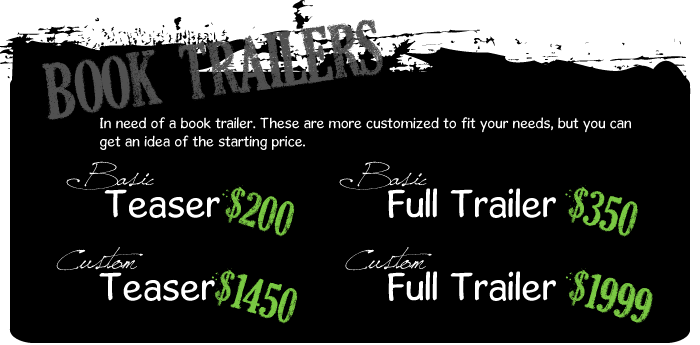
              1 comments

              Book Trailers & Blog Commercials

              Read more...
              Saturday, November 7, 2009

              New Design is now Live!

              3 comments
              One of my favorite designs so far has now gone live.  Stop by TinasBookReviews to check out her new look! I'm really liking what I did...not to toot my own horn.  But this this design was achieved with the direction of, "maybe a tree, with a butterfly flying around it..."

              Click here to view her site.  Please stop by and tell her how much you like her design. Click here.


              Read more...
              Sunday, October 25, 2009

              Ooh Books Header Design

              1 comments
              I'm a little late in posting this, but I've been on vacation this past week.  Here is Cara @ Ooh Book's header design.  She did a lot of the concept work, even took the photo.  I just did the grunt work.


              Check out her web page - !!! * Click Here * !!!

              Jenni @ Falling off the Shelf - roped me in with a design contest, based on the header image. Which I won...of course :)

              She has rolled out her layout and it is now up and running.  Check out her site and tell her you like the design!


              Read more...
              Friday, October 9, 2009

              Kindle Vixen's New Design

              1 comments
              I'm proud to show off a pretty header/background/button that I created - for kindlevixen.com.  I think it came out quite fan-tabulous. What do you think? If you like it, go by and compliment her lovely site. She had a big part in it's creation also!


              Read more...
              Monday, October 5, 2009

              Custom Design

              8 comments
              Do you want an original design? Tired of seeing YOUR template all over the place? Well you have come to the right place! (yeah this copy is cheesy but does it get your excited???)

              I am an award winning graphic designer & web designer (please hold the applause - it was a little award - from the state of Louisiana) who just happens to love to blog. I'm spreading the love and trying to earn the big bucks by customizing templates for those of you that appreciate my artistic abilities. To see examples of my work, please use the navigation on the top of sidebar.


              Read more...

              Labels

               
              Parajunkee Design © 2011 DheTemplate.com & Main Blogger. Supported by Makeityourring Diamond Engagement Rings

              Graphics by Parajunkee Design