Custom domains are $10 a year! Drop that blogspot and join the yourname.com revolution!
I am not promoting GoDaddy - they are just the easiest.
To give your blog an atmosphere of professionalism and a bit more leverage, your own dot com is a good step in that direction. Let me show you how to do it. It's so easy and only cost $10 a year. There is no hosting involved.
My recommendation is straight through bloggers, so there is no ANAME & CNAME changes. What are those? Don't even worry about that, unless of course you bought your URL somewhere else.
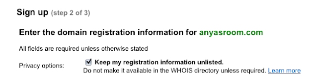
In this demonstration I am going to purchase a URL for my Mommy Blog, Anya's Room. The current URL is anyasroom.blogspot.com
I am purchasing anyasroom.com
STEP 1. Go to your dashboard
STEP 2: Click on
Settings
STEP 3: Click on
PUBLISHING
STEP 4: Click on
CUSTOM DOMAIN
STEP 5: Pick you URL. Let me make a few suggestions here. The smaller the better. If you Blog Title is: Chick that Reads Under Oak Trees (chickthatreadsunderoaktress.blogspot.com) well you might want to rethink that URL. You might want to try chickthatreads.com or underoaktrees.com
If both those are taken, mix it up: chickreads.com readsunderoaks.com just keep it quick and to the point.
STEP 6: Hit Check availability. If your URL is not available, like I said before, change it up.
STEP 7: Yeah available. Click Continue to Registration
STEP 8: Reason #2 you should go through blogger and GoDaddy. They have the privacy option available without extra money. What is this?
There is this little thing called WhoIs. You can go to a WhoIs look up and see exactly who owns a domain. You have the phone number, address etc. This is how you can do checking on businesses, say you want to check on a site that you want to purchase something from.
That is great for a business, but we aren't really businesses. I'm going to put my home phone number in that area. I'm going to put my home address. This is a mommy blog with pictures of my child, I don't want would be stalkers to know where I live, or say an author who didn't like my review... you see where I am going? Other host/domain registrars charge extra for that privacy feature. This is great that this is offered. Check it off
STEP 9: Fill out the form, you do need to input your phone and address, this is for legal purposes. The man does have to know who is running this domain - in case you turn it into something illegal.
STEP 10: Purchase through Google Check out. They take credit cards as payments, this is very straight forward, like any other online shopping cart.
STEP 11: Go back to your dashboard
STEP 12:
SETTINGS
STEP 13:
PUBLISHING
STEP 14:
CUSTOM DOMAIN
STEP 15:
SWITCH TO ADVANCED SETTINGS
STEP 16: Type in your new URL - don't forget the WWW
STEP 17: Type in your word verification and hit
SAVE SETTINGS
You see where it says WE WON'T LEAVE YOU BEHIND. Another handy dandy feature, blogger will forward you blogspot.com URL to your new one. That is very nice of them!
STEP 18: When you have hit Save, another box appears. Click that box: REDIRECT . This is there so if someone types in anyasroom.com without the www - they won't get an error. You want to make sure you have this checked off, very important.
STEP 19: Word verification again and
SAVE SETTINGS
STEP 20: Check your site. Hit view blog and see that it is your URL that is coming up in the browser.
How can you repay me for this wonderful informative post? Well nothing of course, but if you are a mommy - maybe following my new blog might help. I'M SHAMELESS I KNOW!
http://www.anyasroom.com


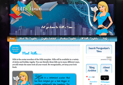


 If you have the perfectly lined-up OCD bug like I do, you might want your "Grab Buttons" and other images lined up on your blog's sidebar. Or you might have a tendency to like blogs with BIG buttons that pop out your sidebars. This is how to fix it.
Let's look at the PJD sidebar.
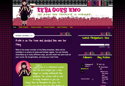
If you have the perfectly lined-up OCD bug like I do, you might want your "Grab Buttons" and other images lined up on your blog's sidebar. Or you might have a tendency to like blogs with BIG buttons that pop out your sidebars. This is how to fix it.
Let's look at the PJD sidebar.